Context
44 states, six weeks and a £20,000 lifetime budget
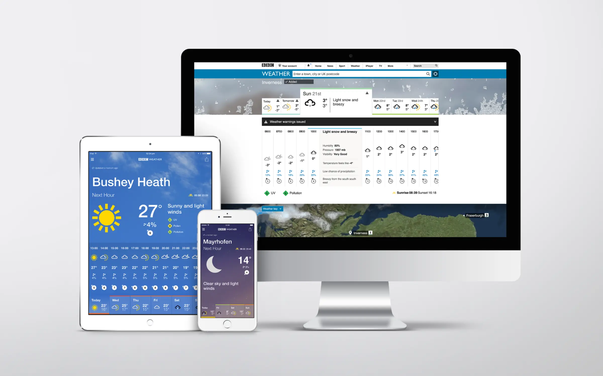
“Window on the Weather” called for natural photography that made the forecast feel like a view outside. I led its translation into 44 accurate, readable weather states for the app.
The £20,000 had to cover the imagery for life, so the BBC needed outright ownership and the freedom to adapt it without further licensing.
I owned the imagery system, production brief and art direction, working with a photographer and agency, with meteorologists involved throughout.

The scope
A complete range of weather, by day and by night
Every state needed imagery that matched the brand, passed meteorological review and kept the forecast readable.
Approach
Choosing what to commission, and what to rule out
My art-direction experience helped me assess each route against the brief: natural imagery, accurate weather, outright ownership and a six-week delivery.
I chose a system of reusable photographic layers: original imagery that we could compose into approved weather states and keep adapting after launch.
Shoot every weather state
Original photography of each complete scene.
Capturing all the conditions separately would exceed the time and budget available.
Photograph shared components once, then combine them into multiple weather states.
License stock photography
Source existing photographs for the range.
I could not rely on finding a consistent set that met the brand and meteorological requirements. Licensing also left future use tied to rights management.
Commission imagery and source layers the BBC would own outright, including future use and adaptation.
Matte-paint each scene
Create the weather through painted compositions.
It offered control, but I felt it would lose the natural photographic quality that “Window on the Weather” needed.
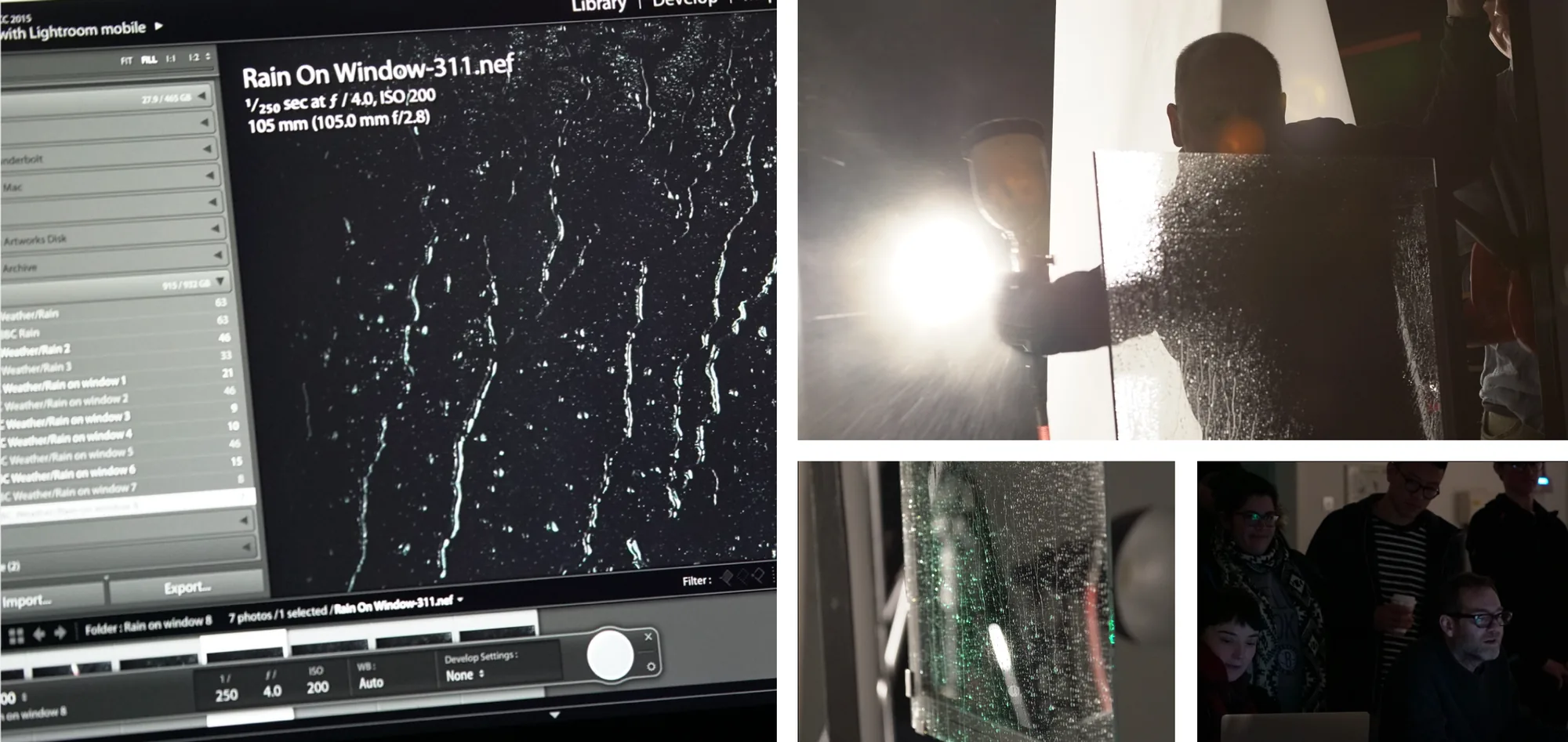
Use real skies and photograph rain, frost and condensation on glass as separate effects.
A method carried over
My theatre background changed how we built the images
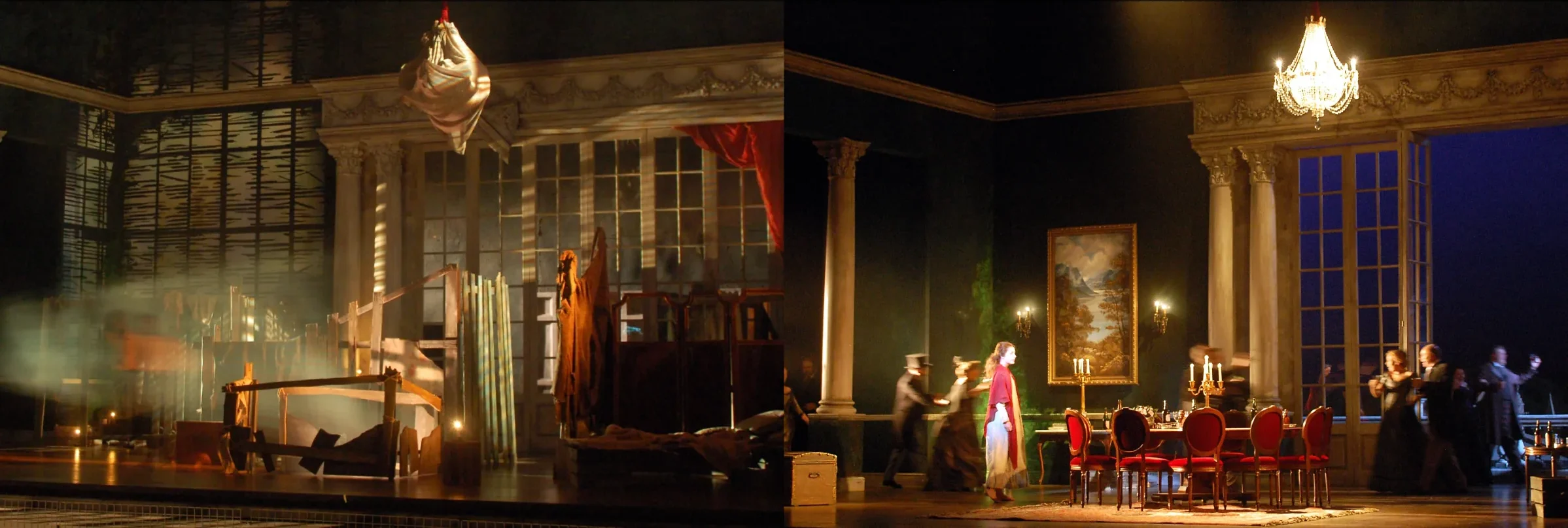
In scenic painting, the same flats can read differently when the lighting changes. I applied that principle to weather: separate skies, clouds and effects, then vary their grading and combinations.
Creating the imagery
Four decisions that shaped production
With the layered approach agreed, the work turned on four decisions: what we could safely reuse, how to keep expert approval moving, when to put the forecast first and how to leave room for change.
Meteorology
Securing expert agreement before committing to the shoot
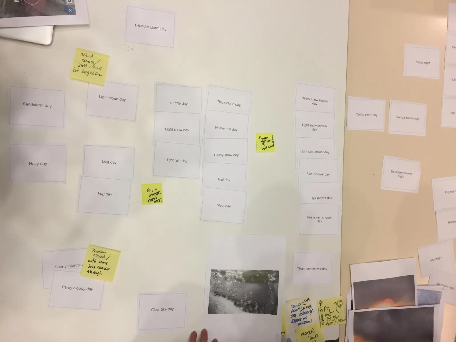
The system depended on knowing what we could safely reuse. I brought meteorologists into a card sort to agree the minimum layers needed for all 44 states and identify the distinctions we had to preserve.
For example, light cloud could be graded darker for a heavier cloud condition. Agreeing this upfront gave me an approved basis for the shot list and detailed production brief.
Production
Keeping expert approval inside the six-week schedule
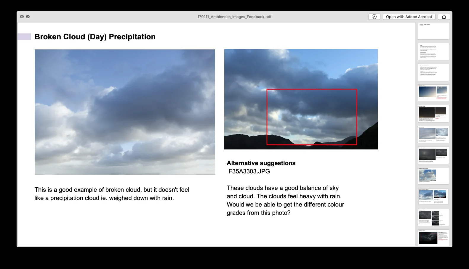
I set up daily reviews so accuracy decisions happened as the imagery came in. I categorised the photographs, reviewed them with meteorologists and translated their feedback into production instructions.
The review below shows the level of judgement involved: broken cloud was not enough; it had to look rain-bearing too. Final sign-off sat with the meteorologists, my Creative Director and me.
Legibility
Putting forecast legibility ahead of dramatic imagery
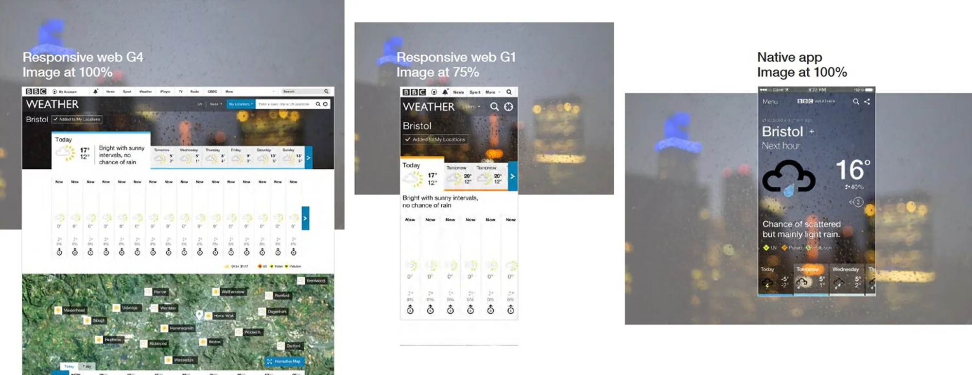
A strong photograph could still fail behind the forecast. I manually checked every image across all breakpoints, with additional spot testing, and compared day and night variants behind the app screens.
The reviews established clear rules for the imagery:
- Keep the horizon below the forecast text.
- Soften contrast behind the numbers.
- Blur the imagery back to a gradient when people need to read detail.
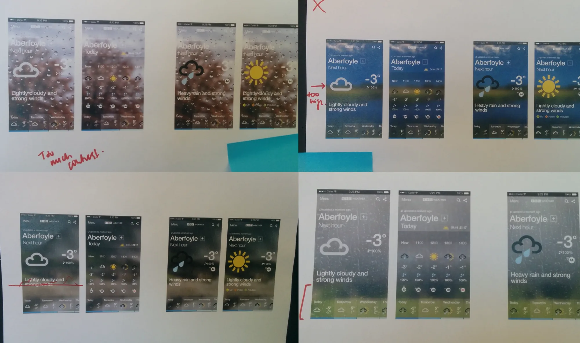
Day and night stress-test comparisons


Flexibility
Giving the BBC room to change the product
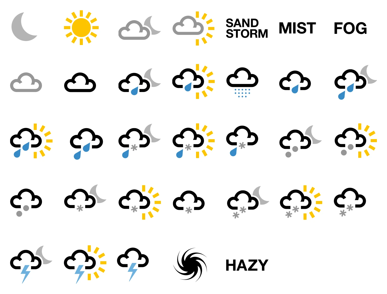
I kept skies, clouds and window effects separate so the imagery could evolve. If animated rain were introduced later, for example, the static window effect could be switched off.
That flexibility has already supported new device crops. The BBC could reuse its source assets without another shoot or additional licensing.
The finished set
All 44 states, by day and by night
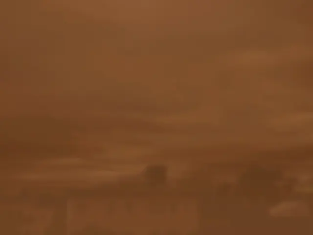
Every weather state has a day and a night version, shown here side by side.
- Sunny / Clear sky
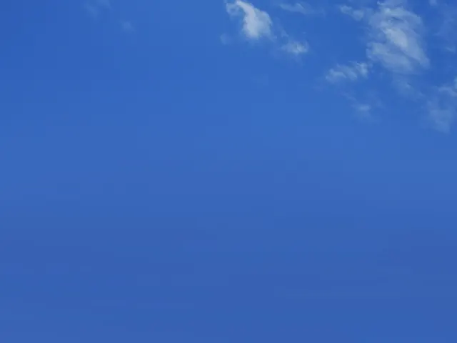
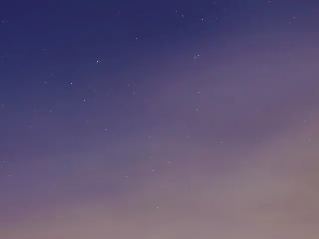
- Sunny intervals / Partly cloudy
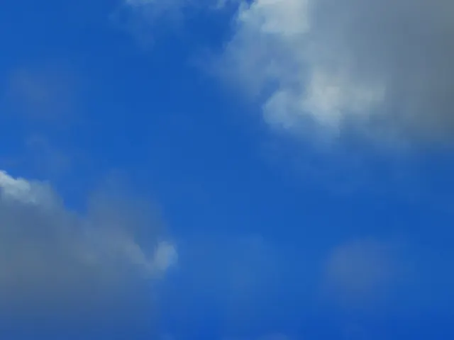
- White cloud
- Thick cloud
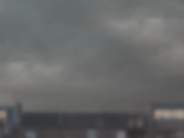
- Hazy
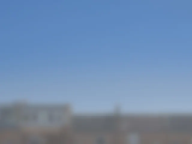
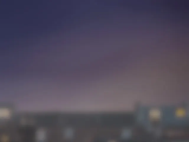
- Mist
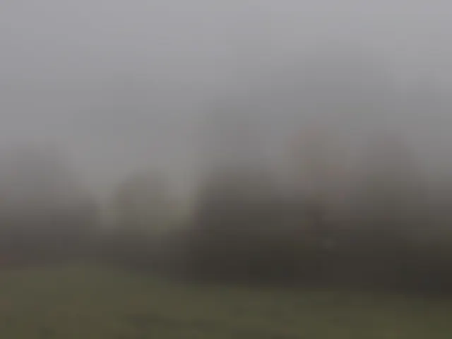
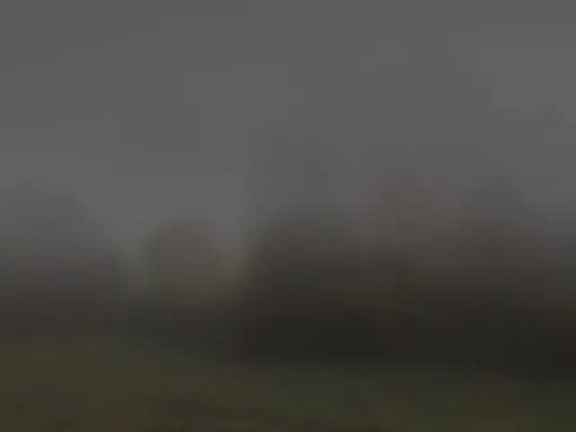
- Fog
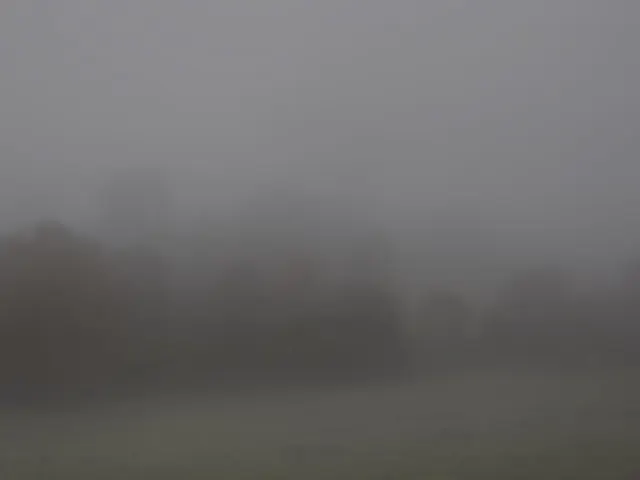
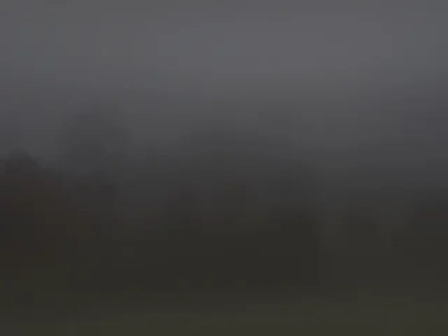
- Drizzle
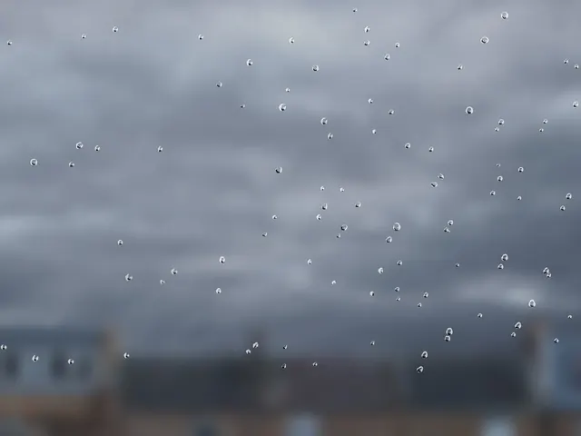
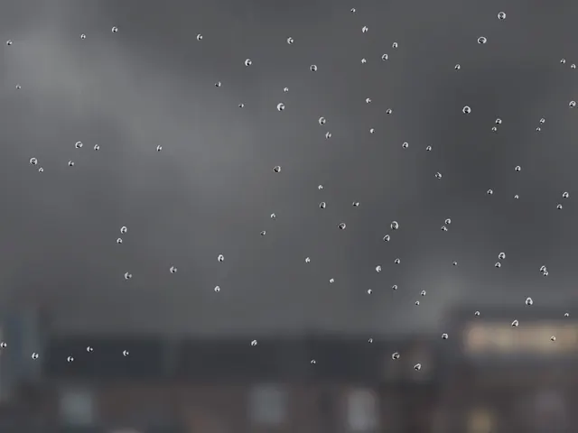
- Light rain
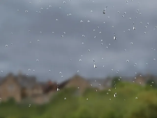
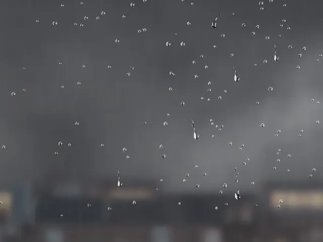
- Light rain shower
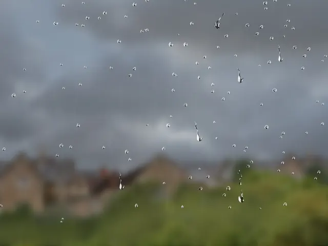
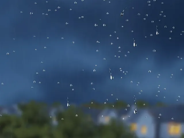
- Heavy rain
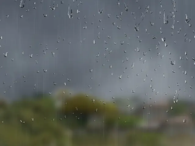
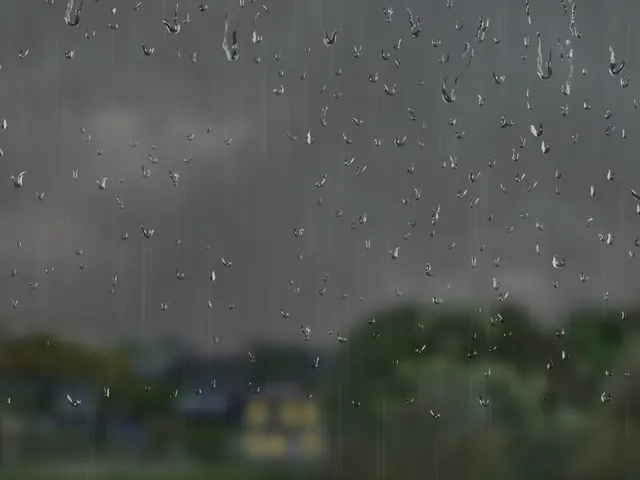
- Heavy rain shower
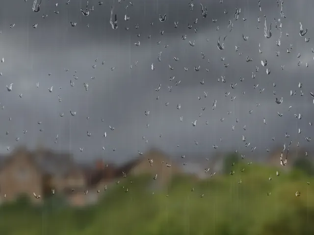
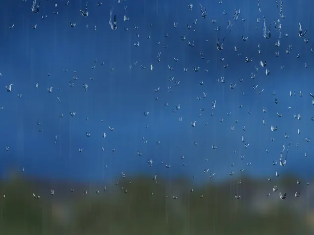
- Sleet
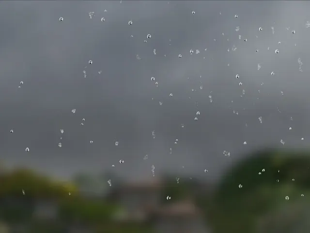
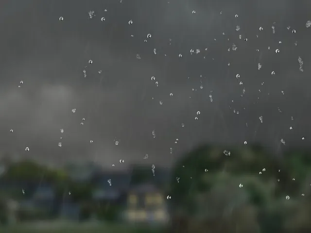
- Sleet shower
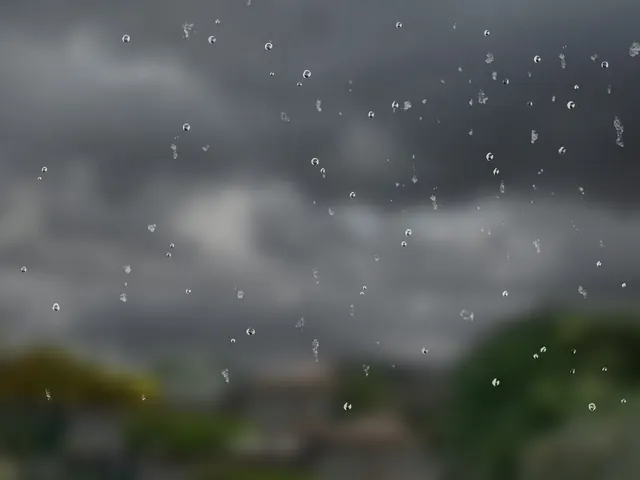
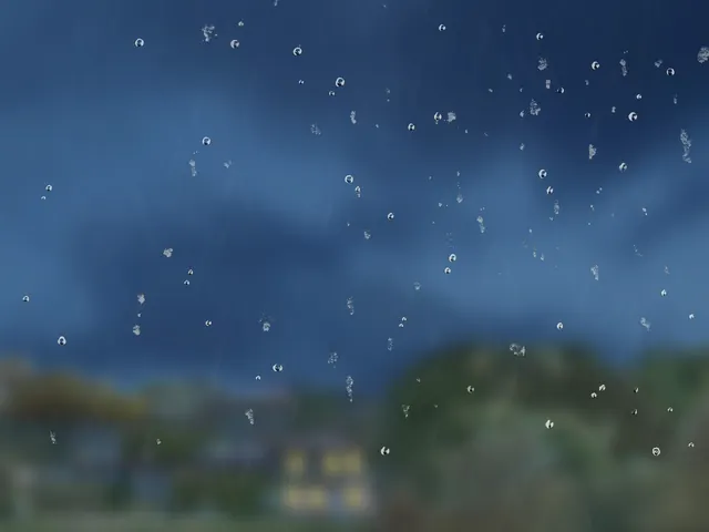
- Hail
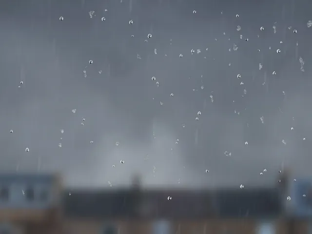
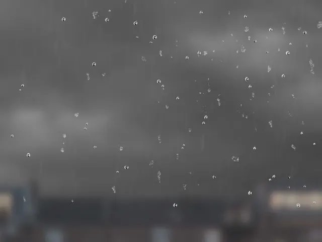
- Hail shower
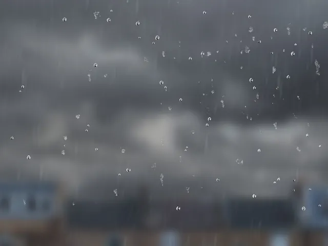
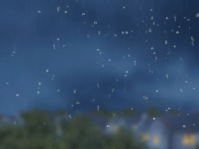
- Light snow
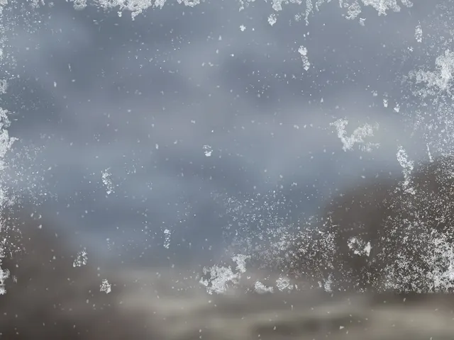
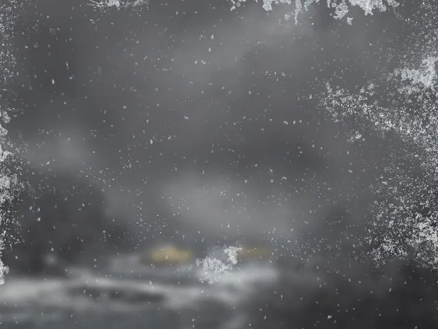
- Light snow shower
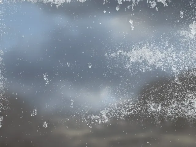
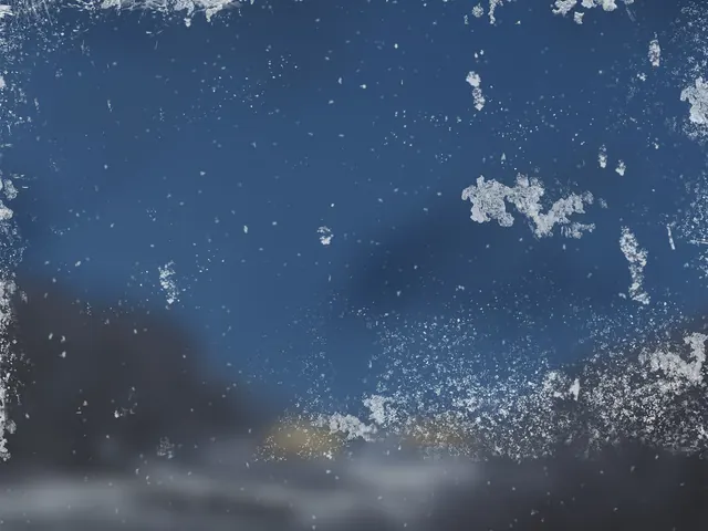
- Heavy snow
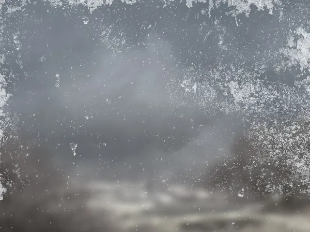
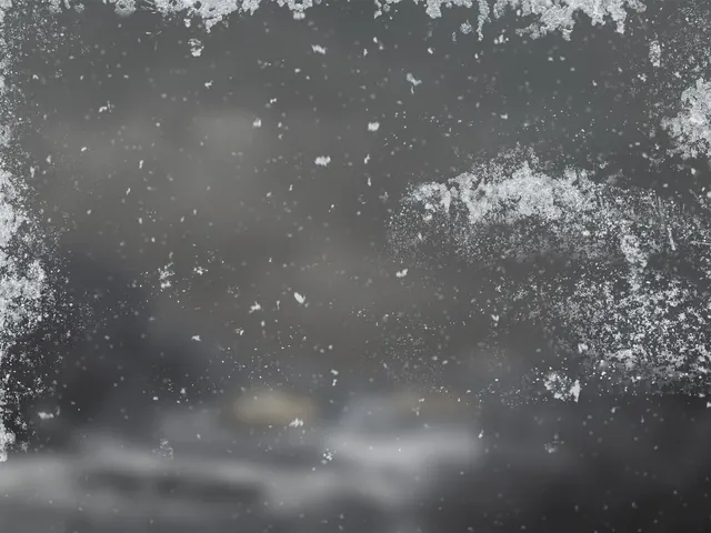
- Heavy snow shower
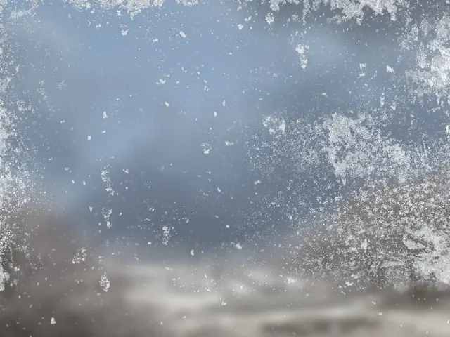
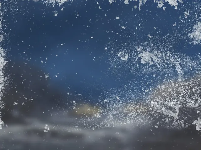
- Thunderstorm
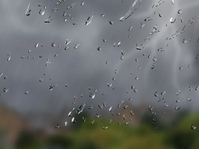
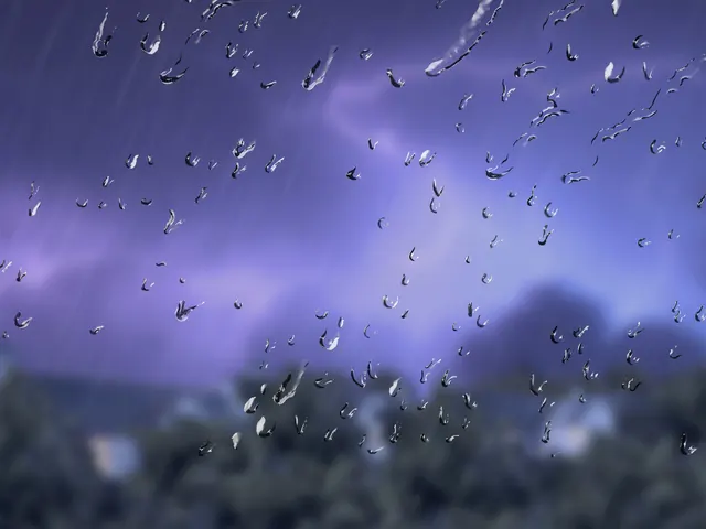
- Sandstorm
Results
44 states delivered, with ownership for the future
All 44 finished weather states were delivered in six weeks, within the £20,000 lifetime budget, and launched with the app redesign. The same imagery is still behind the BBC Weather forecast today.
The BBC retained outright ownership of the imagery and layers, including future use and adaptation, with no ongoing licensing costs or rights management. The source layers have since been reused beyond the launch set, including for changing device crops. Separating the layers also left room for future effects without committing the product to them at launch.
Weather states at launch
Weeks from plan to delivery
Total lifetime budget
Reusable photographic layers
Audience response
Unprompted response after launch
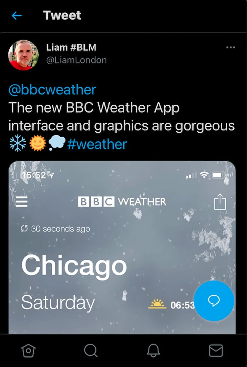
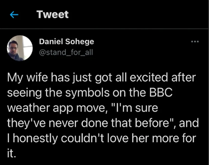
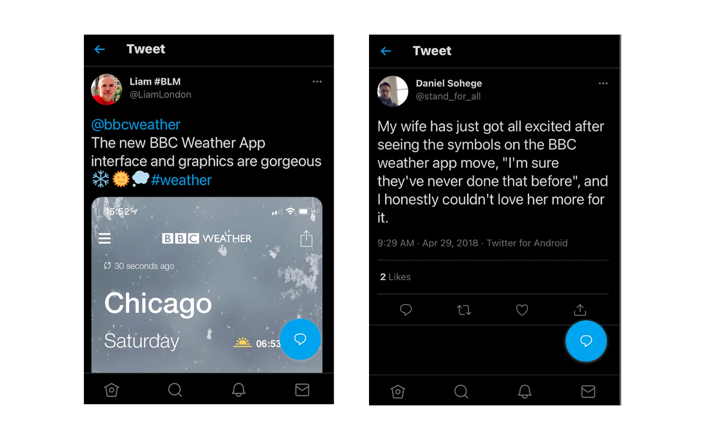
Weather is part of people’s day, so they notice when it changes. People posted about the new imagery, and about symbols that now moved.
Reflection
What I learned
A lifetime budget changes the design brief
Ownership and future adaptation shaped the production approach from the outset. Thinking beyond launch led me to reusable source layers that the BBC could keep using as the product changed.
Make expert review part of production
The card sort brought meteorologists into the approach early. Daily reviews then turned questions about accuracy into specific decisions about cloud, grading and composition while the work was still being made.
Thanks to
Yael Levey Creative Director.